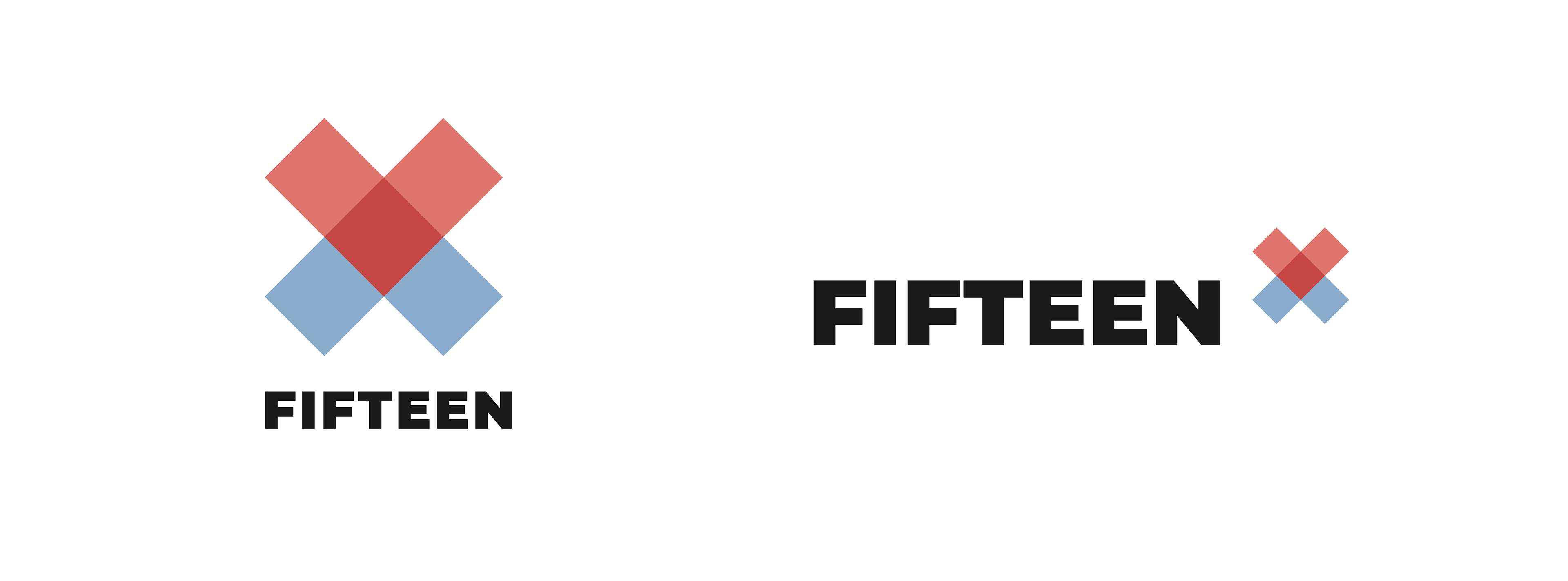
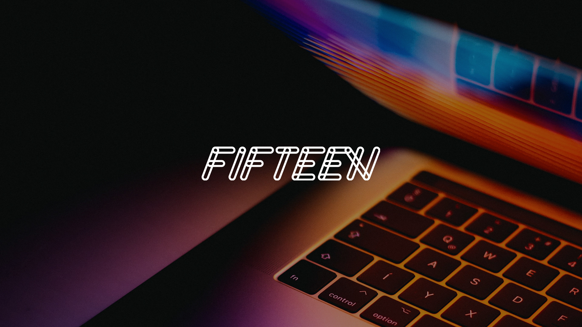
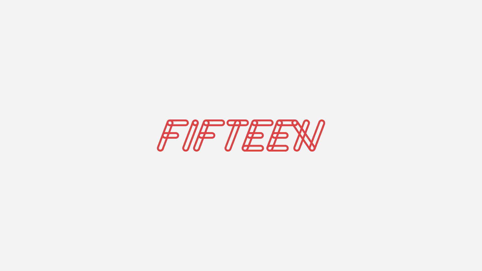
Fifteen
Brand ID: Tech-happy ever after
Merged by two established ICT (Information Communication Technology) companies, Exltech and VExpress, Fifteen (also known as Fifteen XV) was created to empower partners with flexible, resilient, and market-leading cloud solutions for any business, of any size, anywhere.
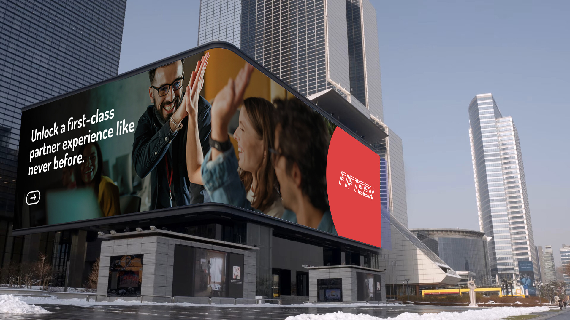
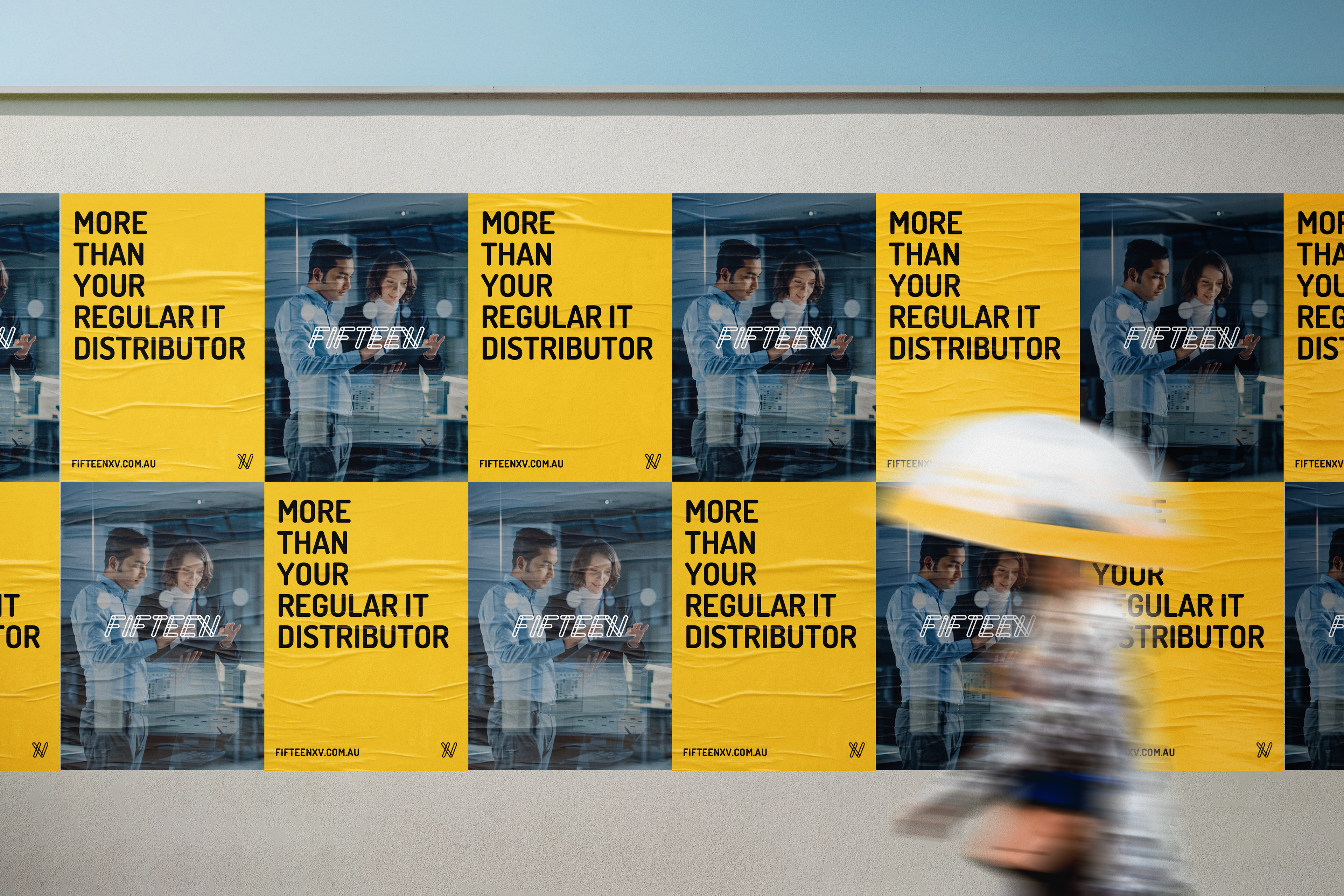
Breaking away from the cold, technical image of typical ICT brands, we positioned Fifteen as approachable and customer-focused, delivering tailored services and creative solutions with clarity, confidence, and relatability.
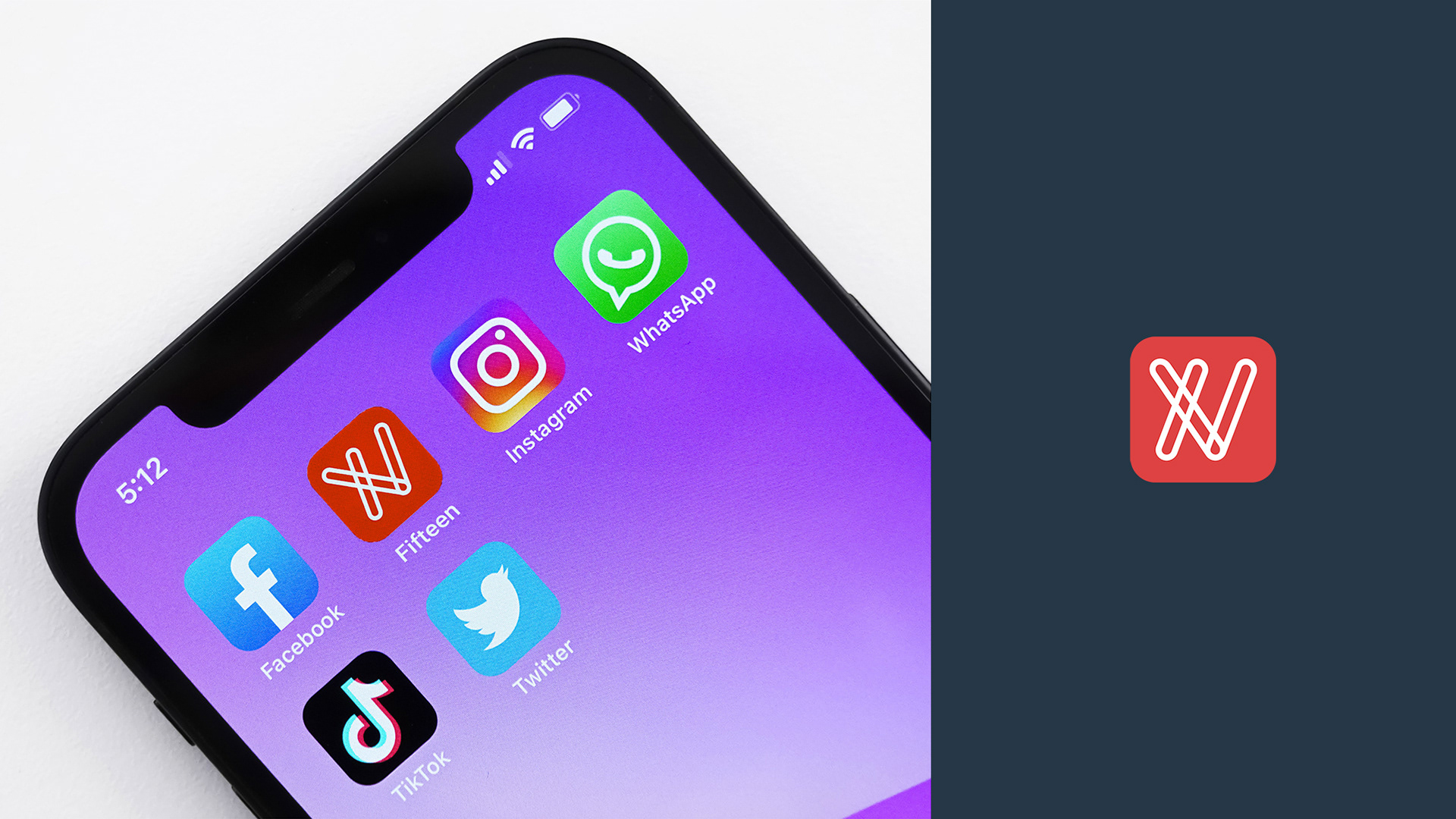
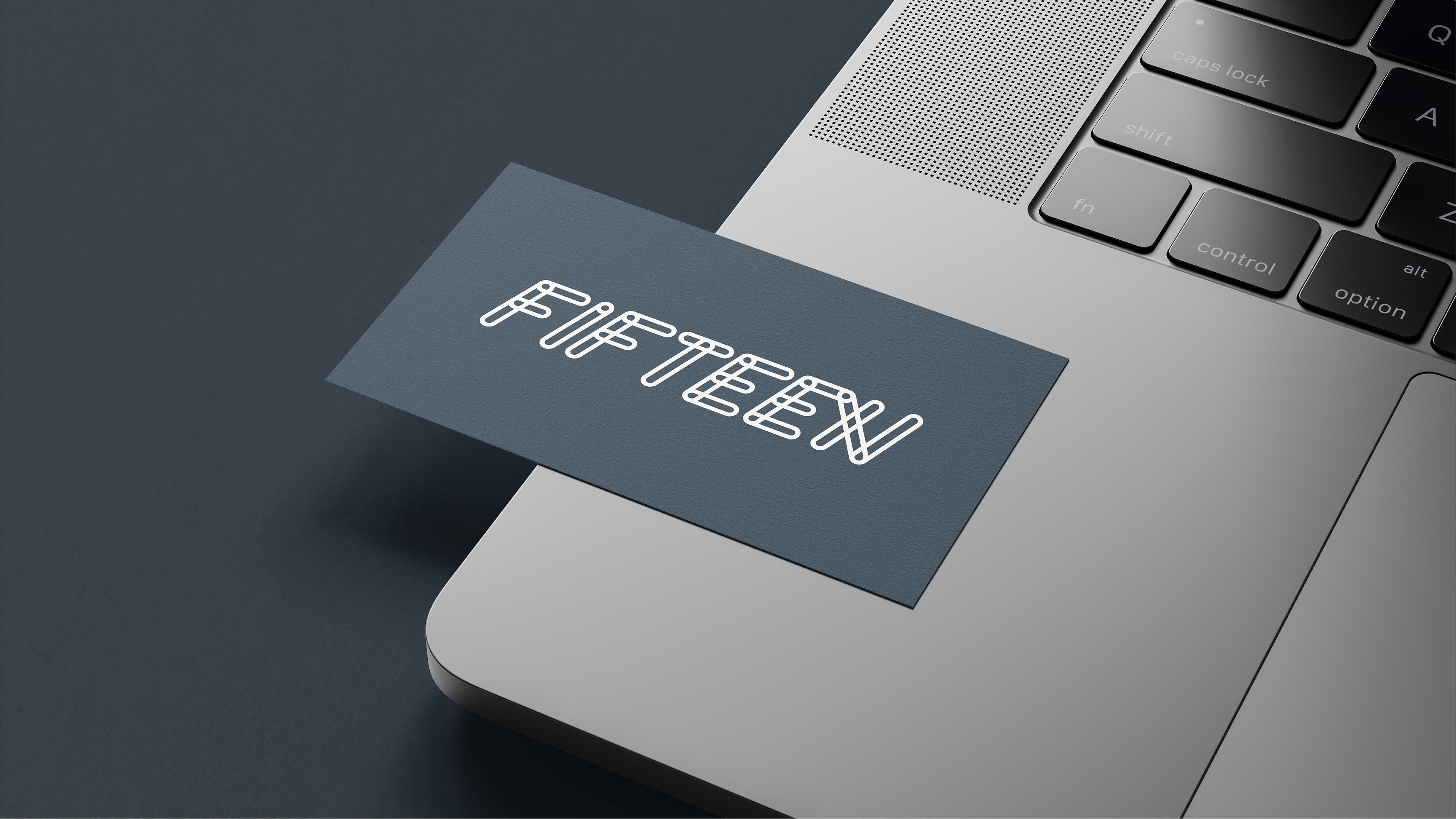
The rounded, connected stroke logotype reinforces this friendly tone. By request, the ‘XV’ is subtly embedded within the letter ‘N’ — a clever detail also used as the app icon and favicon on the newly designed website.
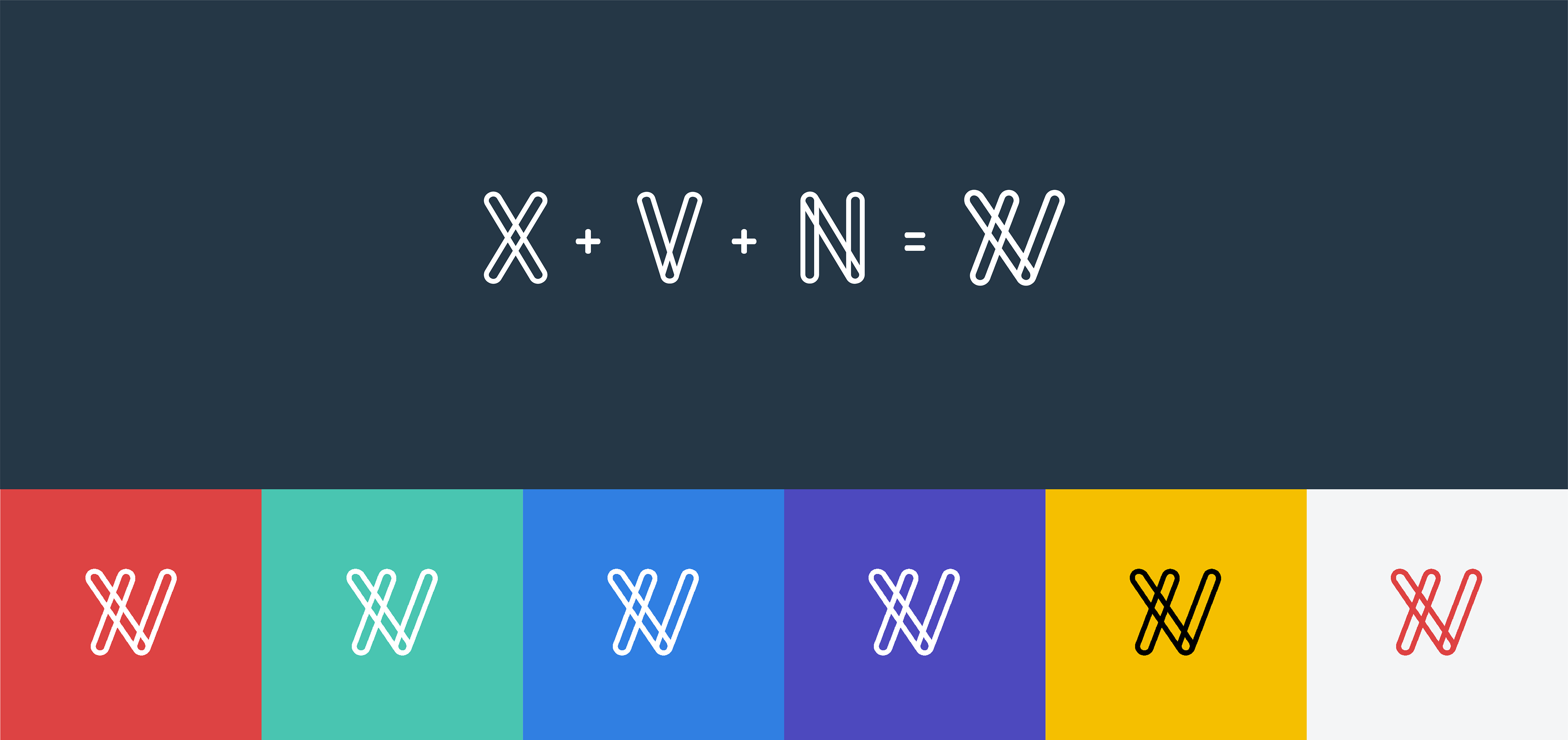


Proposed Logo Variations
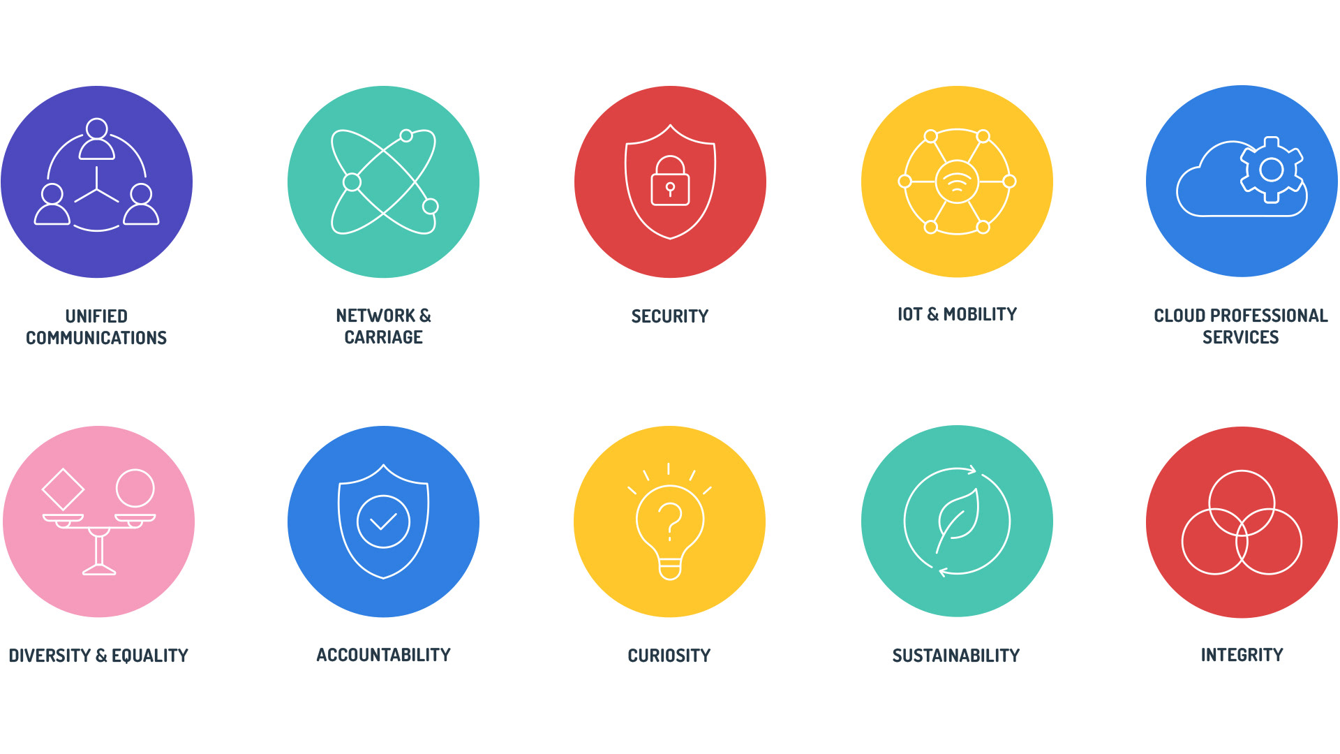
The main challenge of this project is playing around with the ‘XV’ - as per the client's request, it has to be subtle and blended within the logo, but still recognizable. The below variations are matching with this idea, and also demonstrate the proof points of communication, connection, and the friendly atmosphere that Fifteen XV wants to bring to their customers.